Commercials, billboards, labels, clothing--advertisements are everywhere. Look around. I can guarantee that an advertisement of some sort is within your visual frame. Though many of us consider ourselves immune to coercive marketing ploys (myself often included), a NeuroFocus study has shown that this is apparently not the case.
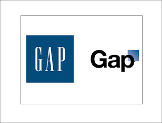
Gap, the multibillion dollar clothing company empire, recently attempted to update its old logo (on the left) to a newer, fresher, design (on the right). However, the strategy grossly backfired, ending with the decision to switch back to the original logo. Considering that upwards of ten million dollars were spent on the new look, this was clearly not an easy defeat to admit.
So, why the epic failure? According to the study, Gap's new design violated several aesthetic neural templates that humans intrinsically prefer, such as:
1. The blue cube covering part of the "p" distracts the viewer from the holistic brand name, which should be the focal point of the logo.
2. Our brains, being hardwired to avoid sharp edges, react negatively to those of the blue cube overlapping the "p."
3. The font of the new logo is relatively similar to most to which we're exposed on a daily basis, so there is no real sense of novelty.
4. There is less contrast in the new design, which is black on white, than in the old, which made the white letters stand out more against the blue background. Thus, we are inclined to pay less attention to the new logo than the old one.
5. "Gap" is capitalized in the new logo, which sparks our brains to search for some sort of tangible meaning to the word (like that found in a sentence). The most effective advertisements and marketing ploys tend to utilize all uniform letters, lending more attention to the brand name.
6. As is evident above, the new logo is a sharp contrast to the old logo. Because it is so unrecognizable from the original, people may have difficulty associating what they already know about Gap as a company with the new logo.
The new logo fiercely disregards brand loyalty. What were they thinking? Change is difficult for many people and is not embraced with open arms. I am wondering how much research was conducted and analyzed before this major shift in a branding image.
ReplyDelete